Six Big Business Intelligence Mistakes
![]()
Organizations of all sizes are making major IT investments that they hope will lead to better decisions being made up and down the line, but how all that data is presented has become a major issue. Instead of relying on spreadsheets, organizations are now investing in data visualization tools designed to make it easier to identify relevant information.
Data visualization has emerged as a critical tool for telling the actual story behind the data. So to help organizations more easily manage and understand their data, Qlik this week announced the general availability of Qlik Sense, an implementation of its own data visualization tools that can be deployed on a server.
Qlik CTO and SVP of Products, Anthony Deighton, says the goal is make it easier for end users to collaborate via a server application in a way that allows the IT organization to maintain control and governance over data access.
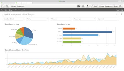
Previous instances of the data visualization software developed by Qlik ran on the desktop. By creating an instance of the company’s software that runs on a server, Deighton says Qlik is providing the means that IT organizations need to control the chaos associated with distributing business intelligence reports.
Ultimately, Deighton says Qlik envisions organizations being able to expose the reports they create inside Qlik Sense via application programming interfaces (APIs), which will enable the reports created using Qlik Sense to be consumed by other applications.
While there’s no shortage of data inside most organizations, the challenge is finding a way to present it in a way that allows users to not only understand what all that data actually means, but also verifies that the conclusions being made are supported by the underlying data.
Data visualization, of course, is a catch-all term for the software that accomplishes that goal. But as Deighton notes, data visualization without governance tends to be little more than a lot of pretty pictures in support of a lot of unsubstantiated facts.