There’s no doubt that the debate around responsive Web design (RWD) has reached the entry level of most organizations, achieving elevated status as a simple way to reach consumers on the Web, regardless of the device they use to access the Internet.
But is responsive design really the right approach to engage your mobile customers?
Roland Campbell, director of solution engineering at Usablenet, can imagine what you’re thinking: “What do you mean? Of course responsive design is right for our mobile customer. Everyone is doing responsive design now, and even Google is advocating for it!”
Before we break out the torches and pitchforks, let’s think about what Google is really saying. Sure Google recommends responsive design as a way for developers to extend content to mobile devices, but they offer mobile specific versions of Gmail and Google Plus, two of their flagship products. With one search field and blocks of content, for example, it makes sense for Google News to take a responsive approach as it is easy for content-heavy sites to repurpose the way the content is presented on mobile devices.
However Ethan Marcotte, who coined the term responsive Web design, states in his book Responsive Web Design, “most importantly, responsive Web design isn’t intended to serve as a replacement for mobile websites”.
Campbell has identified a number of key considerations organizations must examine before they decide to incorporate responsive design.

Click through for key considerations organizations should examine before they decide to incorporate responsive Web design, as identified by Roland Campbell, director of solution engineering at Usablenet.

In a report on mobile customer experiences, Forrester Research predicts that businesses that integrate the use of context – that is, sharing appropriate services, prices, and content with customers at the right moment – will gain significant advantages over competitors. Due to the same content being presented regardless of device, mobile sites built with responsive design are much less able to take context into account when engaging with mobile users.
Understanding the context around use cases of mobile users is a key consideration when choosing the right design direction. Consider the context when a consumer is on the train and wants to read the news. Responsive design will work well in situations where the content served is the same, regardless of the screen size. (The Boston Globe is a great example of this). Now consider the user who is on the train and wants to buy a new pair of boots for the winter. In this case, responsive design is not the best option because the context around this use case demands speed, ease of browsing and task completion.
Responsive design excels when the context demands optimized presentation, but it does not necessarily work well or take advantage of the user needs or the power of that device. With a dedicated mobile site, organizations will have more flexibility to provide for user needs and tailor their experience.

Responsive design requires more than simply adding “float:left” to your CSS. When it comes to responsive design, I-Frames and images are not fully worked out, and still present a significant challenge to developers. To pursue RWD means staffing up and acquiring developers with strong skills in mobile UI/UX and HTML5.
A lesser-known feature of RWD, for instance, is the fact that it requires newer QA procedures that lead to the average site release time significantly expanding as a result.
Further, fixes to one screen size might have unintended consequences for other screen sizes and companies need to consider their approach to OS management. For example, Internet Explorer has released 10 versions since its introduction in 1995 and Windows has had eight full releases over that time. Apple just launched a significant mobile upgrade with iOS 7, and Google’s Chrome browser is on version 31. Creating compelling mobile products requires years of experience working as well as established processes that account for the speed of mobile evolution in terms of UX, device capability and OS requirements.

Desktop websites have evolved over time to deliver extremely rich online experiences, but they do not represent a baseline for mobile comparison. Take a look at your desktop home page and measure the size of its content. For example, the table below shows the size and number of objects on a few well-known, fast desktop web sites:
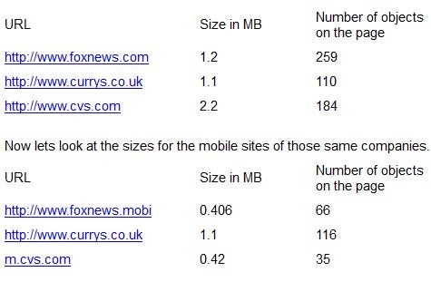
As you can see, the Currys mobile site is the same size as the full desktop website. That’s because Currys is leveraging a responsive site that uses the same file across all channels. Over a Wi-Fi connection, the Curry’s desktop site loads in 4.53 seconds, compared to the CVS mobile site, which loads in 2.10 seconds. On a smartphone with an LTE connection, the Curry’s mobile site took almost 20 seconds to load fully, while the CVS site loaded in less than 6 seconds. Do you think your customer is going to wait 20 seconds for your mobile page to load? The ironic thing is that most of the weight that is downloaded when a responsive site loads on mobile is never shown to the user because many items are hidden to “fit” on the device.

One definite advantage of responsive design is that the URL remains the same for every page of your website. This eliminates redirect code and ensures that Web links will be supported on every device.
While redirects do have to be considered as part of the overall design decision, the pursuit of a single URL may not justify the trade-offs implicit in a responsive approach. The same applies to the appeal of managing a single code base. For many IT organizations, one code base is the promise of RWD, but in reality the associated code will surely include a host of exceptions and conditions to support each break point (i.e. each supported screen size). Ultimately what you will end up with is a very big file with at least three sets of code lumped together.
Ultimately the key to finding the right approach to designing for the mobile Web is focusing not only on achieving internal business goals, but also delivering the kind of experience that customers will appreciate and share with others.